Holistic Color Design
Interior Design
The power of color is tangible, it has a strong effect on our overall emotions and mood.
For example, living or sleeping in a red room while experiencing anxiety and insomnia is not exactly supportive. Someone that feels emotionally stuck
or depressed will not feel any livelier in
a grey room. Decorator color fads or orthodox Feng Shui color recipes are
not the best way to select color.
Color can make us feel sad or happy, similar to a dreary versus a sunny day. Some colors drain our energy while others have the power to energize us.
Designing a color scheme that is pleasing aesthetically and also supports our well-being is like creating a symphony. It’s not just about a particular color but also the hue, value and saturation must to be taken into consideration.
Undertones should harmonize with one another. For example, if a carpet has a pink undertone and the sofa has a yellow undertone they will clash even if the colors are “neutral”.
A room that has only cool colors can
feel uncomfortable and needs warm complementary accents or artwork to feel more inviting.
If a room has predominately warm colors, neutral or cooler accents will create more visual interest.
No matter what your color preferences are, finding the perfect color hue is where the magic happens.
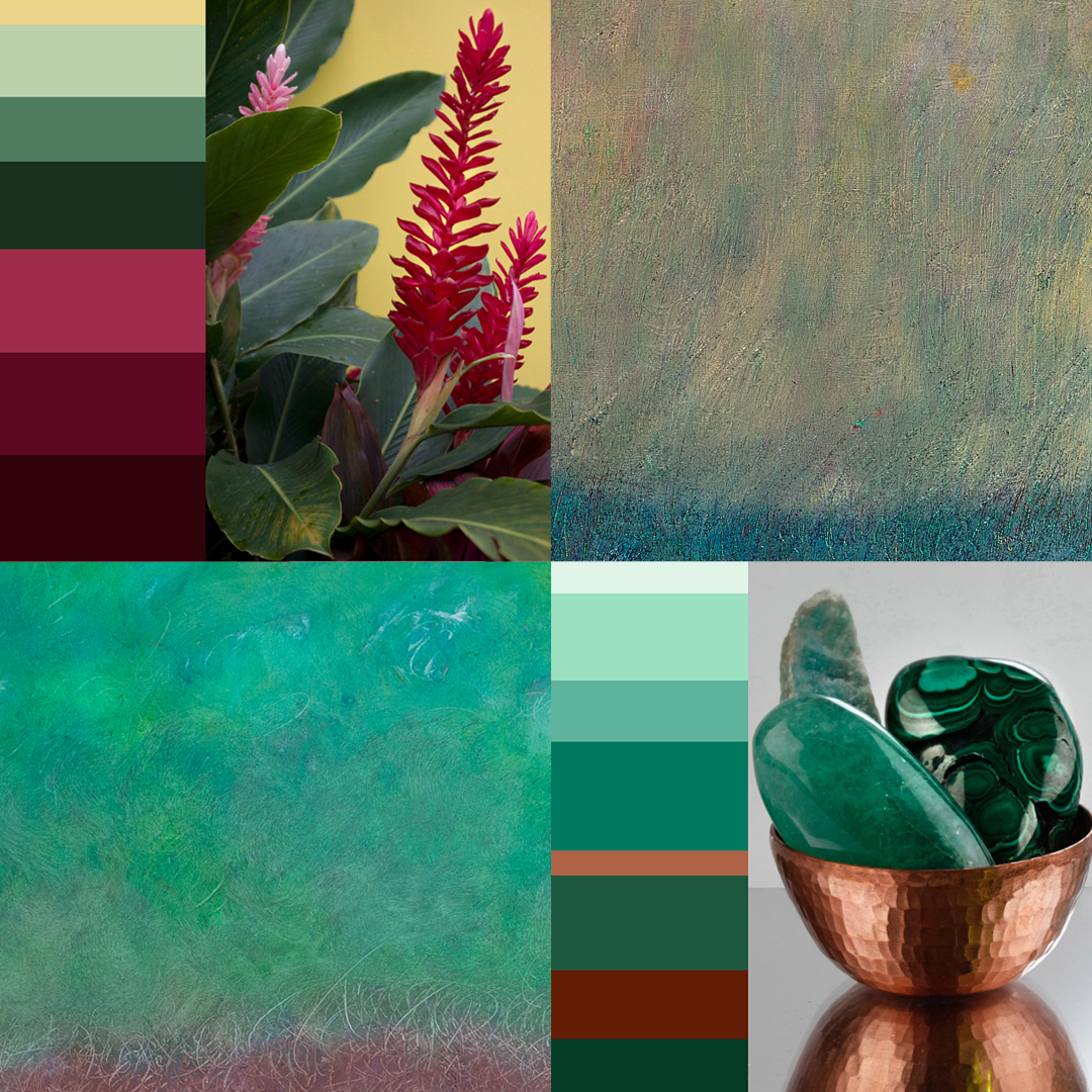
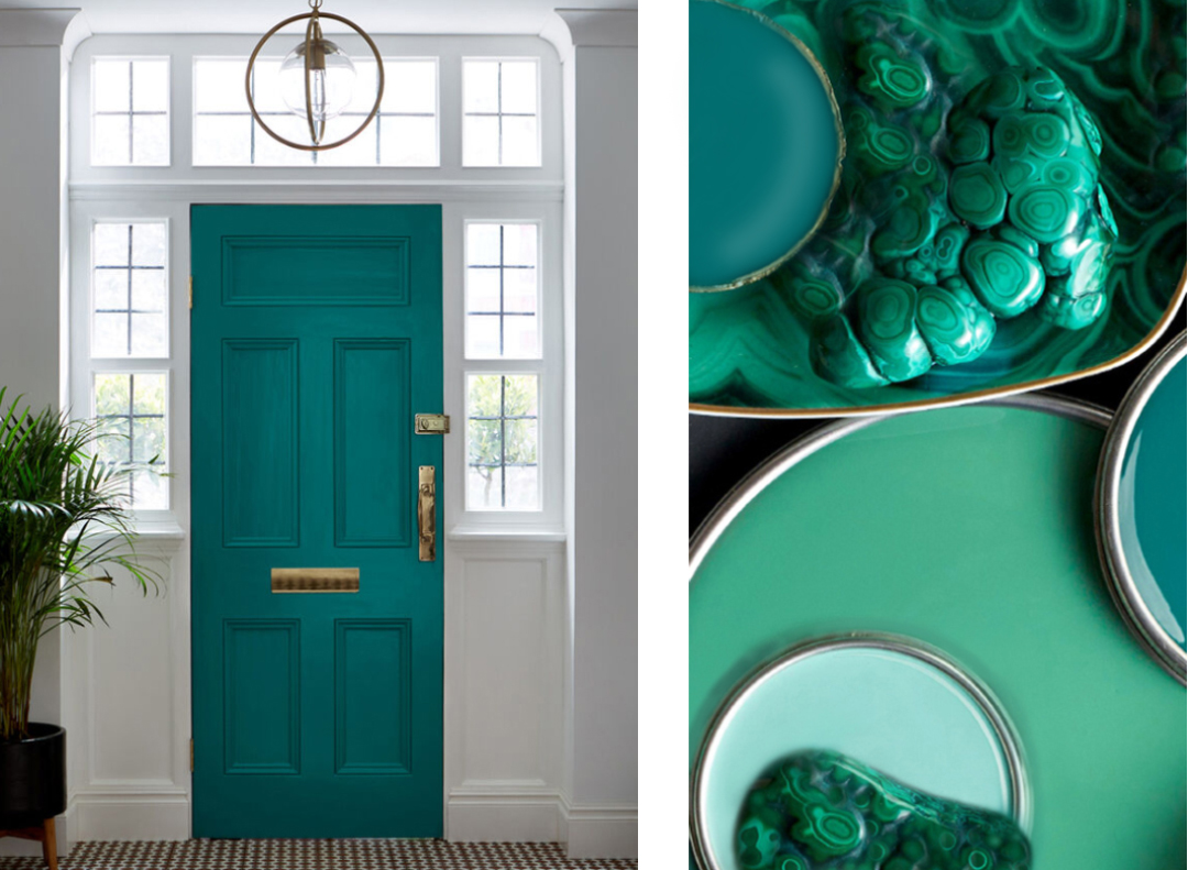
A fun way to design a color palette is using photographs of your favourite objects or artwork as a reference point.
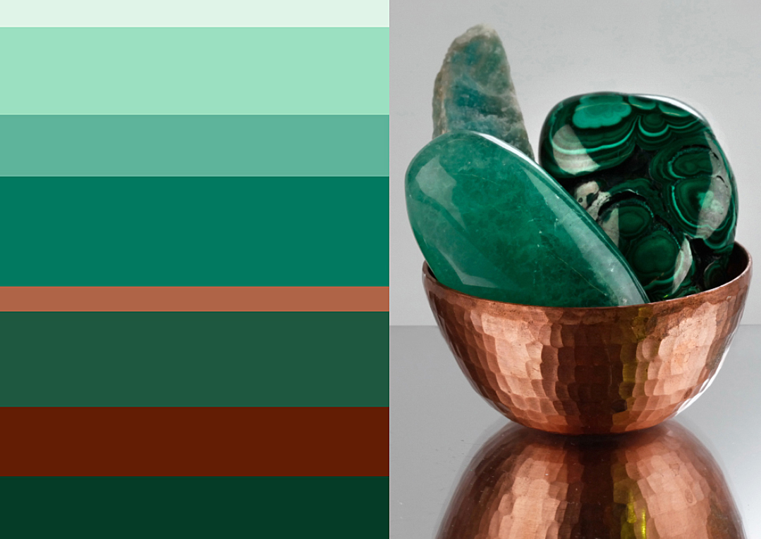
Nature photographs from cherished vacations or your own environment are great color references. This large tropical flower makes a bold statement. Dramatic jewel tones could be utilised as accent colors.
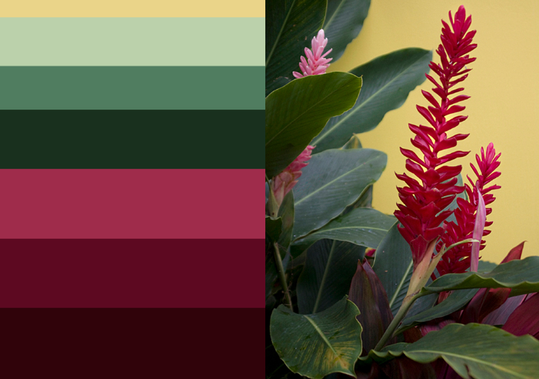
Bold colors are the focal point of a room. In this exemplary foyer white walls complement the front door, keeping the look fresh and inviting.
You can use your favourite color to make a bold statement as long as the rest of the room is neutral or uses other colors sparingly.
COLOR PSYCHOLOGY
Color preferences and dislikes often develop in childhood. If a color is associated with a happy memory it can feel uplifting to wear it or put it in our space. Likewise if a color is associated with trauma it can feel uncomfortable and heavy. Mostly these reactions are unconscious.Using the colors we dislike in small doses can help to heal the original trauma. Colors have tremendous healing benefits and are utilised in many healing modalities.
I love to work with color in my holistic healing Practice as well as in art and design. I apply Ayurvedic Psychology principles to balance the Doha or energetic mind-body type with color.
The conscious use of color in interior design can make a space more inviting and uplift the mood of the inhabitant.
Exterior design
Multiple things have to be taken into considered when designing a color pallet for exteriors. This includes the style of the house, surrounding buildings, climate, environment and the color of other permanent surfaces such as the roof top and ground. Mistakes can be costly and it is well worth it to get professional advice.
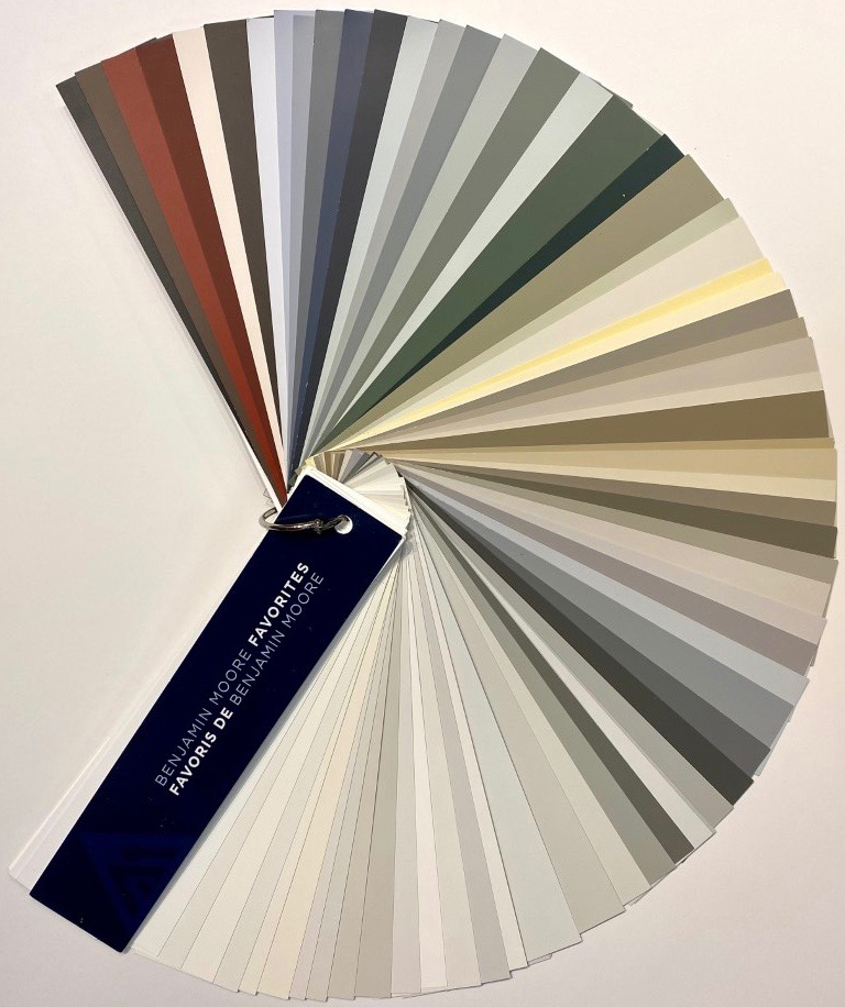
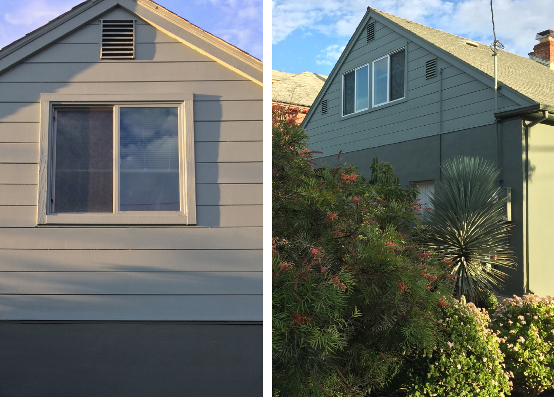
Example1: My clients Bay Area house was previously painted in one singular pale yellow that looked washed out and generic. The client was leaning towards a muted shade of green which can be tricky. Most colors will appear a lot more saturated than on the paint sample after being applied.
In this color design, three shades of grey with green undertones are used to give the house some definition. These complex colors look more neutral or more greenish depending on the light. Because of the subtlety of the green undertone the house will not appear too green or garish at any time of the day.
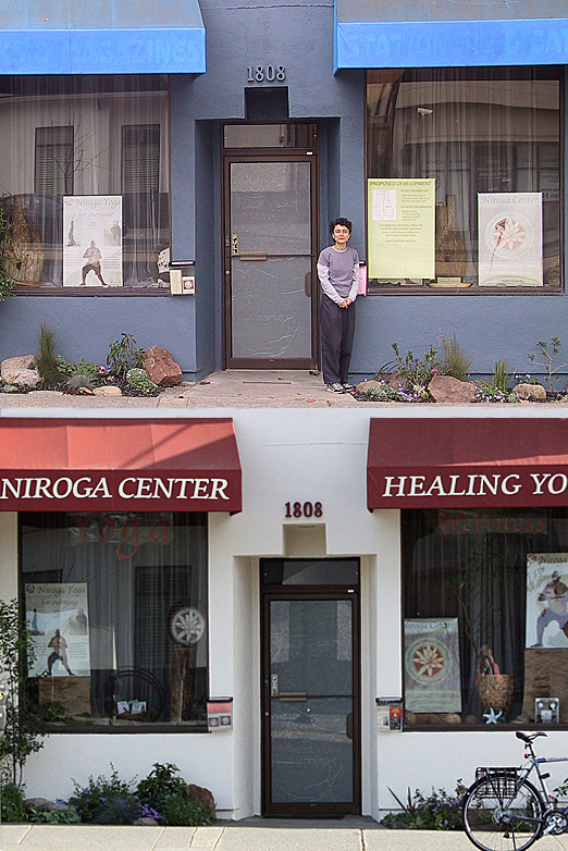
Example 2: A Clients Yoga Center was in need of curb appeal. Dingy exterior colors can make a business lose costumers as people pass by the building without taking notice. The refreshed exterior did help the Center to attract attention and ultimately more business.
Elke Savala is a Holistic Healer & Feng-Shui Consultant
